
Chelsea Brewing Company
Challenge
Launch the First Brewery In New York Since the Depression
Building the first brewery in New York City since the Great Depression was an opportunity to introduce something entirely new. The challenge was to update the traditional brewery concept for a modern New York audience—creating not just a place that made beer, but a brewpub where people could meet after work, have dinner, gather with friends, or host an event. The brand needed to make Chelsea Brewing Company feel like a destination, not simply a brewery.
Strategy
Recall the Glory Days of New York City’s Brew Pubs
I decided to revive the New York City tradition of bars and pubs as neighborhood hangouts—places where a broad cross-section of New Yorkers could gather after work, meet friends, have dinner, or spend a weekend afternoon. Located at Chelsea Piers, part of the larger sports and hospitality complex, the brewery needed to feel welcoming, accessible, and unmistakably New York. That led to a brand strategy built around familiar NYC icons, references, and attitude.
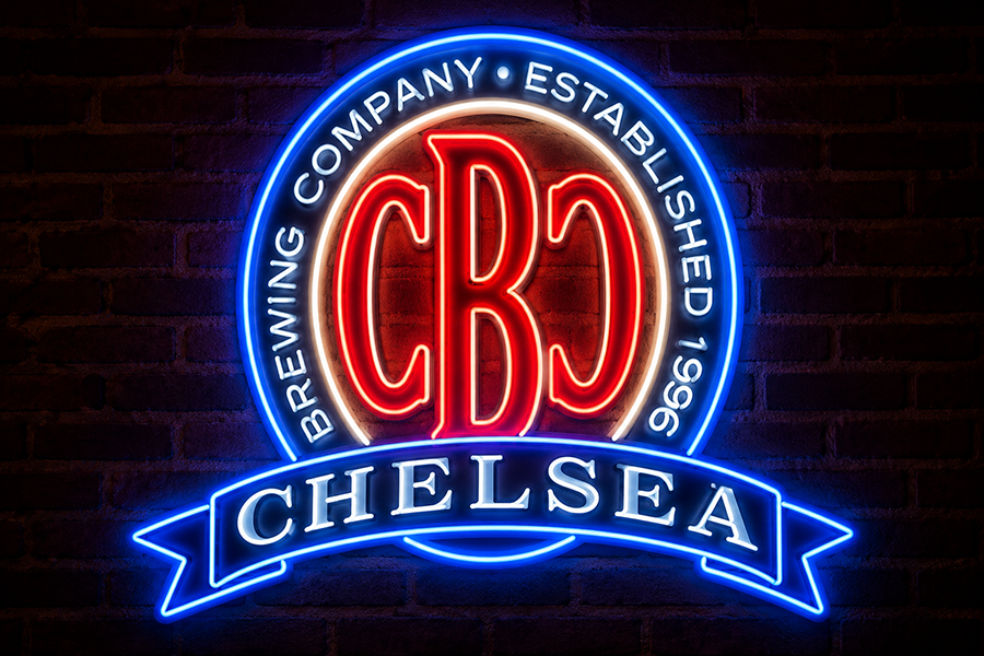
The distinctive Chelsea Brewing Company Logo harkens back to the great breweries of the 1920’s and 30’s.
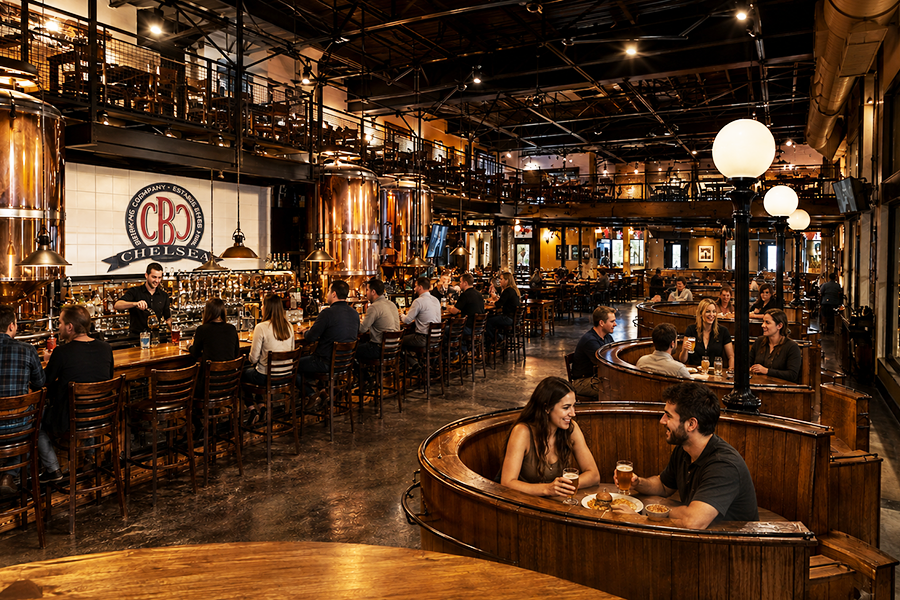
The brewery was also a brewpub, and patrons could see the brewing process and equipment. Nothing beats knowing where your beer comes from.
Execution
A brand that embodies the City.
Taking my design cue from the iconic New York City Checkered cab, I created a comprehensive branding program that was also applied to the physical brew pb, creating a consistent, authentic experience.
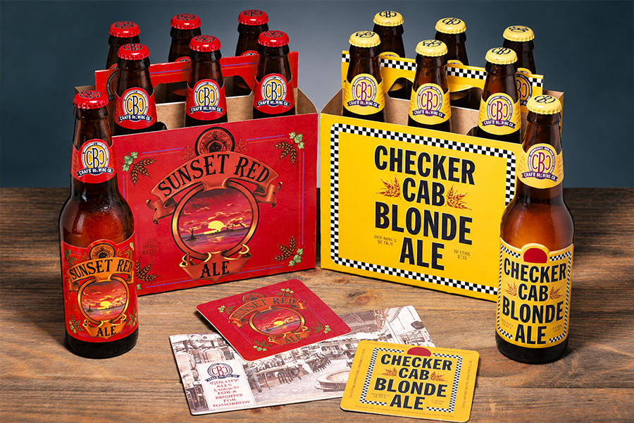
The full branding package: bottles, bottle caps, six-packs, coasters
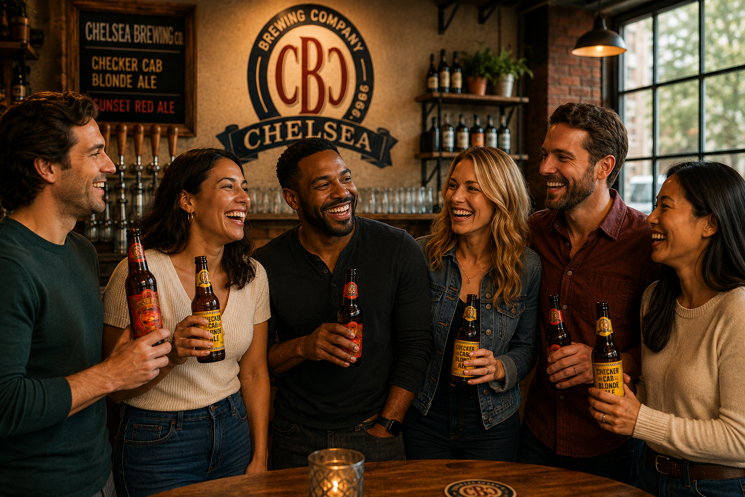
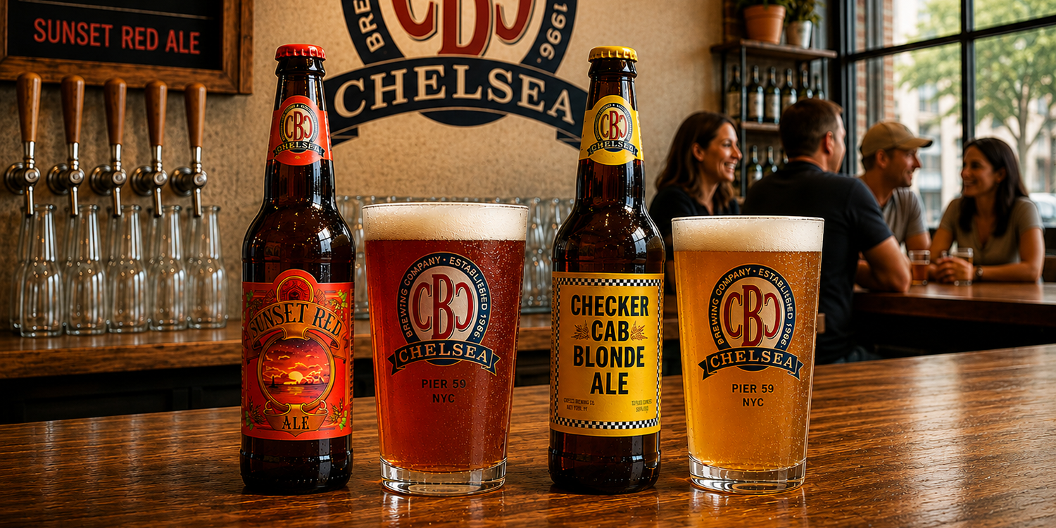
Ending the workday with friends and a cold Chelsea Brew.
Outcome
Packaging that reached beyond the Pub.
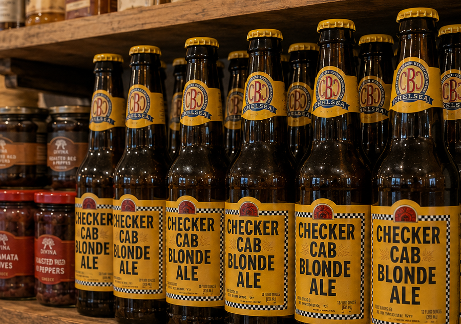
Chelsea Brewing Company became more than a neighborhood brewpub. Its distinctive New York identity helped turn the brewery into a destination while giving its beers a life beyond Chelsea. Checkered Cab Blonde Ale and New York Harbor Sunset Red began appearing in other bars, restaurants, and gourmet markets, extending the brand throughout the city. What started as an identity for a local brewery became a recognizable consumer brand with an unmistakable sense of place.



Michael Pilla Strategist · Designer · Author | Author of You Oughta Be In Business »
© 2026 NoNonsense.Design · Privacy Policy